1.30.2009

Boodro Steps Down

Michael Boodro stepped down today as Editor-in-Chief of Martha Stewart Living magazine, MediaWeek has confirmed. He will be replaced temporarily by Chief Creative Officer Gael Towey, who is also the company's founding art director, until Martha Stewart Living can find a new replacement.

MediaWeek reports that Boodro did not have another job lined up prior to his departure. He had worked in his role as editor-in-chief at MSL for two years, after he left Culture & Travel magazine in 2006.

MSLO did not say why he stepped down.

I have a soft spot for Michael Boodro since he graciously replied to a letter I had written to him in December. It was handwritten on MSLO stationery (above) and personally signed by him. He thanked me for my kind words and actually mentioned Martha Moments! I was very pleased. He will be missed and I certainly wish him the best of luck in his future endeavors!

1.25.2009

Martha Inducted Into Hall of Fame

On Thursday, January 29th, Martha Stewart will be inducted into the American Society of Magazine Editors’ Magazine Editors’ Hall of Fame. Martha shared some of her views on how the magazine industry will fare during a time of economic crisis with Mediaweek in an interview.

Among the revelations, we learn that the new luxury magazine Martha Stewart Living was developing (tentatively titled Panache) has been put on ice, but that it is essentially ready to be launched once the economy rights itself.

Martha also says she firmly believes in the longlasting and timeless quality of her magazine:

Were you surprised about your magazine’s comeback following your legal ordeal?

"I wasn’t surprised at all. I really believe in our customers and I believe they’re intelligent human beings. I’m surprised more aren’t avid customers, that they’ll settle for what I think is less good information. I would’ve thought instead of having 12 [million] to 14 million readers, we’d have more than that. I always thought Martha Stewart Living would be more like National Geographic in its heyday."

Winter Skin Care

The handmade soap I ordered recently from the Beekman farm arrived last week. The glorious showers I’ve had ever since got me thinking about the poor, parched skin that so many of us put up with during the winter months. Dr. Brent Ridge, contributing editor to Martha Stewart Living, and his partner, novelist Josh Kilmer-Purcell, have more or less perfected the art of organic soapmaking using goats’ milk.

The December soap I ordered (with a hint of vanilla, ginger and pine) reminded me of this. Why do we slather ourselves with such harsh substances, day after day? And why do we believe that the harsher the product, the cleaner the result?

In the new Beekman newsletter, Dr. Ridge explains it nicely:

“See, the soaps you buy in stores - even most natural soaps - are not truly soaps. They're detergents. Detergents yield more suds, and we've been erroneously taught that more suds means better cleaning. The true soapmaking process produces natural glycerine, not detergent. However, most soapmakers know that natural glycerine is too valuable of a substance to be wasted in soap. Generally, soapmakers extract the glycerine, sell it off, and replace it with petrochemicals.”

Shocking! And so disappointing. I consider the soap made by Brent and Josh to be a rare treat, but I’m through with putting up with dry, itchy skin. With this in mind, I’ll be looking for real soap from now on. It may cost a bit more, but I think it’s worth it.


Here are a few more winter skincare tips gleaned from various online sources:

Use a humidifier: With the heat on and the windows closed, the air inside can become very dry in the winter. Use a humidifier to place moisture in the air. If you don’t want to invest in an expensive humidifying system, smaller, relatively inexpensive humidifiers can be obtained at a local drug store. Placing two or three of these around your home will help to humidify the dry air. This can keep skin from drying and becoming cracked and itchy. (Plants love it too!)

Hydrate your body: The dehydrating effects of indoor heaters, as well as the cold air outdoors, will sap your skin of moisture. Drinking six to eight glasses of water a day will keep your skin nourished from the inside out.

Wear gloves and a scarf outdoors: Protecting your hands and face from the harsh winds and cold, arid air of winter when outdoors is essential. Wear gloves and a scarf to keep your hands and face sheltered from the elements. The material should be soft and non-irritating to the skin.

Avoid hot baths: Fight the urge to soak yourself in warmth on those cold nights. Long, hot showers and prolonged soaking in hot baths will do more to damage your skin in winter. Keep the water temperature lukewarm and keep your showers brief. If having a bath in a tub is a must, enrich the water with bath oils or creams. Pat yourself dry (never rub) and avoid air-drying your skin, since the evaporation process will only further drain your skin of its natural moisture.

Soaps and shampoos: Use soaps that are natural and free of detergents, dyes, chemical perfumes and antibacterial agents – all of which are drying to the skin. Use soaps rich in natural moisturizers. If you can, avoid washing your hair every day, since it will strip away the natural, protective oils. If your hair feels brittle and dry, use conditioner and once a week give it a moisturizing treatment. (I love Redken for Men's Smooth Down Butter Treat.)

Moisturize often: Apply moisturizer a few minutes after a shower and use heavier moisturizers in winter, particularly ones with higher oil content. Avoid products that contain petroleum as these can clog pores. Look for moisturizers that have been recommended by dermatologists. (I personally love Jason’s organic, all-natural cocoa butter – and it smells delicious!)

Lip balm: Unlike the rest of your skin, your lips do not produce their own natural oils, making them particularly susceptible to severe dryness during the winter. Use a natural lip-balm (such as beeswax) to keep your lips from becoming chapped. And never lick them! The acids in your saliva will only further damage your lips.

Sunscreen: It may not feel tropical outdoors, but the sun can still give you a nasty bite on freezing-cold days. In fact, the sun’s damaging rays can often be intensified by the snow on the ground. In the winter, use a sunscreen that is at least SPF 20. Use higher levels if you’re going to be outdoors for an extended period of time.

Exfoliate: Exfoliate your skin once a week in moderation. While gentle exfoliation can help eliminate the build-up of dead skin cells, too much can irritate skin and dry it out. Dr. Brent Ridge suggests using a loofah for this process.

1.23.2009

Takashimaya

Remarkable florist Peter Seprish, Creative Director at Takashimaya in New York City, was a guest on Martha's program today, demonstrating the art of flower arranging in unique vessels and vases. His designs are exquisite. He has designed arrangements for Martha's residences and, I believe, for the pages of Martha Stewart Living magazine. I thought I'd showcase some of the arrangements done by the floral design teams at Takashimaya, which is located at 5th and 54th in Manhattan. These ones are painterly and gorgeous, and so inspiring!

Takashimaya is a wonderful department store, founded in Japan in 1831, that originally sold handmade kimonos. The store in New York has a floral division, a Japanese tea room and restaurant (featuring Chef Taro Mitsuiki), a housewares section, as well as menswear and women's divisions. The store itself looks extraordinary. I haven't been there before but on my next trip to New York I definitely plan a visit. In the meantime, I hope these Takashimaya arrangements inspire you to create your own.


1.21.2009

Essays On Martha's Homes

I’m working on a series of mini-essays about Martha’s houses, primarily focusing on how the design and function of the house in question reflects Martha’s personal development as a tastemaker and homemaker: where she was in her life when she purchased and renovated a certain house, what her interests were at the time and how a given house embodies those tastes and ambitions.
I’ve given titles to the essays already, which hint at the themes the essays will cover:

Turkey Hill: Wicker, Gilt and the Birth of D.I.Y.


Lily Pond Lane: Teal, Taxidermy and the Editor’s Eye


Skylands: Inherited Elegance in Rockefeller Country


Cantitoe Corners: Gray Efficiency on the Corporate Farmstead


To get myself inspired to complete these essays I’ve designed booklet covers for them, which you can see below. I’m trying to keep the essays concise and relevant, making notes about the particular facets of the houses’ functions in Martha’s life, keeping track of the collections at each residence, the furniture, the palettes, the architecture, the restoration processes that were involved and, of course, some of the history associated with the properties. I intend to link these findings with the evolution of Martha’s personal taste and her corporate ambitions, drawing parallels between Martha’s exterior branding processes in the world of media and the quiet interiors of her homes: subtle and not-so-subtle reflections in the paradigm of her dual life.

It’s not easy and it’s not going to be a fast project, especially since I don’t have personal access to the houses or any of the documents associated with them. I am relying entirely on what has been previously published about them and then drawing my own conclusions based on my own observations of the numerous photographs I’ve seen over the years. (If anyone has any suggestions about where to find more raw material, please let me know.) All of this will be done in my spare time, which is minimal, so please be patient. I'll work on them one at a time in those rare moments when I can sit down alone and put pen to paper.
I really don’t know when these four essays will be completed. I probably shouldn't have said "coming soon" at all! My goal is to have them done by next fall. I did want to let you know that I’m working on them, however, and to hopefully get you excited about the prospect of reading them.

I may publish the finished essays here when they’re complete, or I may simply reveal excerpts. Either way, I’ll let you know when they’re finished and anyone interested in receiving the finished PDF can request it through email and I’ll send along the completed attachment.
I think they’ll be unique in the sense that they will be based primarily on the observations of an examiner and student of Martha Stewart’s residential holdings – all of which will be filtered through the previously-published material available on her homes. They will be the essays of a layman, a non-architect, an unaccredited interior designer who has never actually seen these places. They will be the essays of a curious reader, an astute observer and a great admirer. Hopefully they can be taken and appreciated on those levels and with that understanding in mind. I certainly hope that Martha will embark on creating her own book (or books) about her homes, as she said she was going to a while back, with a firsthand, inside look at the abodes with the owner herself as the guide. In the meantime, I will enjoy the process of doing my own little studies of their grandeur.

1.14.2009

I'm a Closet Case!

Well, not really. (I came out of those dreary digs about 17 years ago!) But I do have a serious case of closet envy, a condition that afflicts millions. Even as a child I enjoyed having clean and organized closets. I loved little boxes and storage compartments, and even though I wasn't much of a clothes-horse, I did enjoy using closet space as a means to an organizational end for much of my "stuff."

I decided to showcase a few of the fantastically-organized closet spaces f
eatured in the pages of Martha Stewart Living over the years. Many of them are superb examples of finding space where you think there may not be any, or using unconventional spaces for new uses, such as offices.
Hanging space may be sufficient in your closet, but it's often hard finding space for shoes, bags, belts, scarves and garments that need to be folded, such as sweaters. The closet above was fashioned out of an armoire and fitted with a closet-system shelving unit. The shelves were custom cut to fit the armoire and were attached to hanging racks that can be adjusted up or down as needed. The top shelf houses handbags; shelf dividers attached to the second level keep the stacks of tops and sweaters from tumbling down. (They're arranged by color so that you can quickly find what you want to wear.) A fifteen-by-fifteen-inch, three drawer cube matches the shelving and is ideal for stashing scarves, ties, jewelry and other small items. Adding a row of hooks along the tops of the doors allows for belt storage and two rows of stackable, clear storage boxes keep shoes organized. Undergarments and socks are kept in the lower drawer.
Here is a similar system from the same issue of the magazine (January, 2005) that features labeled and lidded boxes for storage.
This closet, featured in the January, 2009, issue of Martha Stewart Living is long and spacious. Numerous drawers keep clutter in check, as do storage boxes along the top shelf and side shelves. Handbags are stuffed with acid-free paper to retain their shape and kept in flannel sacks to protect them from light and dust, stowed on two upper shelves at the far right. A basket on the lowest shelf is used as a place to put clothing items for donation and windowed boxes covered in tweed, towards the left of the photograph, display folded sweaters for easy access.
Being kind to clothes between seasons and wearings is an investment in their longevity. Use appropriate hangers so that jackets and shirts retain their shape, and stack sweaters from heaviest to lightest. Above left, we see a drawer of clotheskeeping accessories, such as an assortment of cedar inserts (which help keep insects at bay), dried lavender for sachets and a series of lint brushes. Jackets and shirts are kept perpetually dust-free with dust protectors, while woolen scarves and mittens are kept in craft boxes wrapped in acid-free tissue paper until they're ready for use next season. A handy belt hanger keeps belts easily accessible and on display, while garment bags (identified with a digital photograph of the item inside) keeps the clothes protected from blanching light and dust.
His-and-Hers closets are made more interesting by creating an accent wall within using bold-printed wallpaper in different patterns.A teenager's bedroom is outfitted with a veiled workspace, tucked into an area originally reserved for closet space. When not in use, the curtains can be drawn.
This kitchen broom closet was converted into a much more handy workspace. A large calendar on the wall keeps multiple schedules in check while a measuring tape glued to the front of the desk surface makes quick work of measuring. Correspondence is kept streamlined and tidy with a wall-hanging mail sorter and clips hung from a dowel below one of the shelves. Storage boxes keep random supplies in order and a filing cabinet on wheels can be easily tucked under the desk surface along with the stool when it's not in use. It can all be hidden away by an attractive Roman blind that rolls up or down as needed.
I included this photo of Martha's dressing room at her former residence in Connecticut, Turkey Hill, for the sake of nostalgia. I love the large, gilt-edged Federal mirror and the pumpkin pine flooring. Three Colonial doors front her closet space.
Martha also used a closet in the back hallway at Turkey Hill to create an office space, something I found ingenious enough to try myself:
A walk-in-closet in my former apartment was far too large for the small amount of clothing I had at the time. (I'm a minimalist at heart.) I used Martha's idea of fitting an office into a closet by setting up an inexpensive desk from Ikea in the unused closet nook. Books were stored on the hat shelf above and I hung photographs around the space to liven it up.

1.12.2009

Rooms By David Jimenez

Last week I received a very kind email from a reader named David Jimenez telling me how much he enjoyed reading my blog and learning more about Martha’s ventures, her homes and her magazines. I always respond to personal emails regarding Martha Moments and I was happy to do the same for David. I thanked him for his compliments and soon discovered the subtle link to his website in his original message to me.

Well, when I followed the link I was blown away by the visual feast that awaited me and realized that I had to feature him on the blog!

I quickly discovered that David is an incredible designer, renowned across the United States for his classic visual underpinnings and clean, collected style. Born in New York, he has lived in San Francisco and now currently resides in a restored 1906 manor house in Kansas City. He is Vice President of Visual Merchandising for Hallmark and has enjoyed similar positions for companies like Restoration Hardware and Pottery Barn. In this capacity, David is responsible for designing the look and layout of the stores, keeping in mind the design philosophies and themes of the retailer while never forgetting his own personal tastes and attractions, which guide his aesthetic.

David kindly agreed to a Martha Moments interview, which you can read below. He also graciously sent these incredibly beautiful photographs of his homes: a stunning manor in Kansas City with an adjacent carriage house, and a dreamy vacation home in Palm Springs. Thank you David!

How did you come to find your extraordinary home in Kansas City?
It was love at first sight. I was exploring neighborhoods as possible options for my move to Kansas City from San Francisco in January, 2005. This is one of the first houses I saw. I loved everything about it, from the copper dormer windows to the buff color brick and molding details. It’s what I envisioned as the quintessential Kansas City home.
You’ve said your approach to decorating is organic and that it doesn’t follow a particular pattern of rules. What inspires you in design and how might you describe your style?

I would describe my style as casual, collected, personal and inviting.

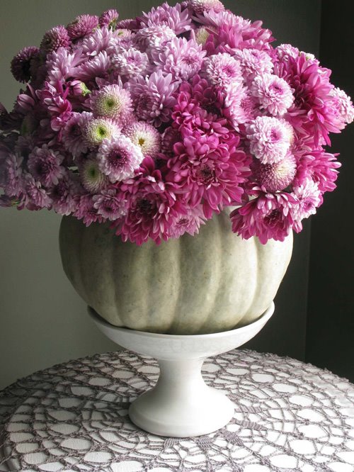
I am passionate about flea markets and thrift stores because I love the character and warmth that vintage pieces lend to a room. I often allow the items I purchase influence the color palette or point of view for a particular room.

A good example of this is the Chesterfield sofa that’s in my sunroom. It’s an old Ralph Lauren sofa I purchased at a thrift store. It was in terrible shape.

I had it reupholstered in brown velvet and added the dining table, vintage lamps, wing chairs and rug to the room.

So what was once a tattered-looking sofa became the anchor to one of my favorite rooms in the house. You'll notice the Ralph Lauren Chesterfield in the sunroom, seen in this photo.


The Carriage House behind the main house is such a beautiful and luxurious space. Describe the carriage house and your approach to designing it.

I lived in the carriage house for a year and a half while I upgraded the main house.

At the time I set it up with my furniture from San Francisco, which had a more contemporary vibe and created a nice contrast against the classic architecture of the main and carriage houses, both built in 1906.

After moving to the main house, I took most of the furniture in the carriage house to the attic and made the space warmer by changing some of the furnishings.
The living room in the carriage house.The office in the carriage house.

As VP of Visual Merchandising for Hallmark, and previously for Restoration Hardware and Pottery Barn, you obviously have a breadth of experience working in design. How does your professional design intersect with your personal design?

I think it happens in reverse. What I do at home influences what I do at work. Ever since I was young enough to move the furniture around in my parents living room, I have enjoyed trying new ideas and mixing things up.

The spaces I created at Pottery Barn and Restoration reflected the same sensibility I loved in my surroundings at home.

The living room in the main house.
The sitting room in the main house.


In your Palm Springs house, you use yellow so effectively, like little bursts of sunlight around the rooms. I’ve always found it a difficult colour to work with. What are your secrets to using vibrant tones in interior design?
I wanted the house in Palm Springs to give a nod to the classic “rat pack” era of the 1950’s.


I chose an edited color palette and used the citron yellow color as an accent on a few walls throughout the house. For me, the key with working with such a bright color was to use it sparingly for drama. I also coated the floors in white epoxy to unify all the rooms and create a floating sense of lightness in the house. This also creates a breezy transition between indoors and outdoors.
The living room in Palm Springs.The dining room in Palm Springs.

You’ve said that flea markets, tag sales and second-hand shops have yielded numerous treasures for your own design. Considering these economically challenging times, many people might now consider interior design to be an elusive luxury. How can timeless interior design be achieved, even on a low budget?

Nothing gives a room more character than a unique, one-of a kind find that resonates emotionally. I look for interesting pieces that have unique lines, and often re-paint or reupholster the items to fit my décor. And not only is it less expensive than buying from a traditional furniture store— shopping thrift stores, estate sales and flea markets is also the quintessential way to “go green.”
A serving buffet in the dining room.
A reupholstered chair in the bedroom.

You obviously admire Martha Stewart otherwise you wouldn’t be a reader of this blog. What makes you a Martha fan?


Martha is an icon and has had a huge impact on American design. I’ll always remember how much I enjoyed reading the first issue of the magazine. I immediately became hooked by her message. It’s been wonderful to see how she has evolved her brand over the years. I continue to be a huge fan of hers.Martha has said recently that a standalone Martha Stewart store is not out of the realm of possibility. How might David Jimenez approach visual merchandising for The Martha Stewart Store? What would I see if I walked through the doors after you had designed the space?

A space the reflects the personal viewpoint and clarity of her brand: Inspirational, clean, edited, well-organized... and with a lot of soul.

What are some things at home you can’t live without?

Fifteen-watt light bulbs, they cast the warmest glow. Baies Candles by Diptyque, my all-time favorite scent. My CD collection with favorites from Aretha to Amy Winehouse. A cocktail shaker, always at the ready. And good friends which leave me feeling loved...and with an occasional hangover.
Low, atmospheric lighting is a Jimenez feature, such as here in the study of his Kansas City home.


What are some things we would never, ever see in a David Jimenez interior?


Great question! Truth is, similar to fashion, what’s old starts looking new again if enough time has passed.

The one thing you’ll probably never see in one of my interiors is plastic-covered furniture.
I have plenty of painful memories of being a kid at my grandmother’s and having my skin stick to the sofa while wearing shorts and a hang-ten tank top on hot summer days.

Visit David's website for more inspiration: http://www.djimenez.com/

1.08.2009

The Garden In Winter by Suzy Bales

The garden in winter isn't much to write home about. Or so I thought. It was while browsing through Suzy Bales' latest book, The Garden in Winter, that I hastily changed my mind. I became so enamoured of the book's gorgeousness and informative text that I bought two copies: one as a Christmas gift for my father (who is an avid landscaper) and one for myself.
The book is primarily for northern gardners in locations that receive snow during the winter months. It examines the benefits of planting (and planning) a garden while keeping "the Quiet Season" in mind: planting with an understanding of which plants will produce maximum winter rewards, in terms of colour, texture and architecture. Bales, who says she is too much a gardner to allow herself to stay indoors for long, was determined to plan her six-acre, Long Island garden in such a way.
The book is lushly illustrated with photographs of Bales' garden and the gardens of friends and colleagues. The text is deeply informative, full of hard-won wisdom and well-researched science: this is not just a "pretty book." Although,it is pretty! There is even a section on making wreaths and winter arrangements from branches and clippings from the winter garden, as well as ideas for how to give the outdoor spaces some classic holiday flare at Christmastime with lights and ribbons.

Any fan of Martha's books will also find this book to be useful, beautiful and inspiring.

Bright pink, ‘Aloha’ roses on the arbor in the vegetable garden blush red in the frost.


Suzy Bales had her own weekly gardening column in Newsday for two years before joining Family Circle as their contributing garden editor for twelve years. She wrote for The New York Times for a year before joining Better Homes & Gardens as the Sr. Editor for Gardening and Outdoor Living from 2004 until early 2007. She has been featured in Ladies Home Journal, House Beautiful, Better Homes and Gardens, Horticulture, Beautiful Gardens, and Easy Gardening.

Suzy is the author of 13 books. The first eight books were in the Burpee American Gardening Series: Bulbs, Perennials, Annuals, Vegetables, Container Gardening, Roses and Vines, and Ready, Set, Grow, a book on children's gardening. She has also written Gifts from Your Garden, A Garden of Fragrance, Garden Parties and the Down-to-Earth Gardener. The Garden in Winter is her latest.
Suzy won the Garden Writer of the Year Award from the American Horticultural Society in1995, and has twice been awarded the Quill and Trowel Award by The Garden Writers of America. In 2007 she received the Elizabeth Hamilton Great American Philanthropist award for her twenty-five years of volunteer work with abused and homeless children.

She is a regular contributor to Good Morning America, tours on the lecture circuit and has served on the board of The American Horticultural Society and the Garden Conservancy and was a distinguished advisor to The Brooklyn Botanic Garden and Old Westbury Gardens.

Please visit Suzy's blog for more information.

1.02.2009

Flowers By Eddie

Eddie Ross: Former Senior Style Editor at Martha Stewart Living magazine, fourth top designer on the hit Bravo series Top Design (I can live with his design), avid flea marketer, overall fabulous New Yorker and, as it turns out, an incredible floral designer!

Every so often, Eddie will make a classic arrangement for the visitors of his blog, Eddieross.com, which I urge you to see, as gifts for their continued readership. (He puts me to shame!) I became so enamoured of his gorgeous flower arrangements over the last several months that I asked him if I could post them here on the blog. He happily obliged. Call it regifting, call it whatever you want, but I had to show off these visions of floral fabulousness on my blog. The series below seems to follow a beautifully linear, seasonal pattern, that is timeless and attractive. And let's face it, January is a viscious old month, making it all the more important to inject some colour and verve into our homes. Thank you, Eddie! You are a true talent.
Spring: There's nothing quite like a monochromatic grouping of classic roses in a cut-glass vase for a simple but dramatic effect. Eddie has arranged a bunch of this lavender variety perfectly!
Late Summer Arrangement: In a simple glass cylinder, Eddie used an exuberant mix of antique hydrangeas, roses, calla lilies, Scotch thistle and berries. Everything was inexpensive, but it's the colour palette—a soft, muted mix of burgundy, dark purple and peach—that makes the arrangement look so chic and expensive. Here's another one of Eddie's tricks of the trade: If you're using a mix of flowers, as he did here, all with stems of varying color and size, line the vase with a large variegated leaf. It makes for a look that's much prettier and more pulled together.
Late Summer Arrangement: The way these colors mix and play off one another—the punchy red, the muted green and the pale yellow—there's something very Hamptons 1940s beach casual about it. The glazed yellow McCoy vase was picked up at Sage Street. Thanksgiving Arrangement: The flowers themselves are inexpensive —a monochromatic mix of burnt orange roses, deco mums and astromerium from the deli around the corner from Eddie's apartment in New York —together with sickle pears from the super market and fall leaves from the sidewalk right outside his door. With the right color palette (seasonal and very subtle), a good mix of textures and an elegant vessel, found for $15 at a flea market, even the most inexpensive arrangement can look like a million bucks!
November Arrangements: Purpley mums in a gray-green pumpkin, which acts as a cache pot —it’s such an unexpected take on a classic fall arrangement.
For a more traditional take on pumpkin arrangements, stick to the orange kind. They're classic and straight-up pretty, especially paired with hypericum berries and dahlias in all the colors of the season. You know when you're watching a really beautiful sunset and it's those last few minutes just before the sun dips out of sight? The sky bursts into such vibrant colors—rich reds, yellows and oranges—just like these flowers!
Holiday Arrangement: In an antique milk glass compote, Eddie chose a sweet bouquet of white roses, Italian carnations and variegated boxwood, all from the local deli. For an even more elegant holiday feel, he added miniature glass globe ornaments in a frosted silvery gray. Please visit Eddieross.com for more flower arrangements, tips on entertaining, decorating and so much more.