Showing posts with label crafts. Show all posts

3.16.2018

Martha's New "Celebrations" Line at Michael's

Spring is always a harbinger of new things and it's the perfect time for companies to roll out new product lines. Martha's ongoing partnership with Michael's craft stores recently saw the unveiling of an extensive new collection of party supplies called "Celebrations" - just in time for one of the busiest celebration seasons of the year: weddings, graduations, birthdays, anniversaries, Mother's Day, Father's Day, not to mention family reunions and picnics. 
The Celebrations line is sub-divided into colour-coordinated themes, beautifully harmonized to decorate a setting with a cohesive look; there's Black & White, Blue Ombre, Pink Ombre, Copper, Gold, Indigo, Iridescent, Sterling, Meyer Lemon and Mint & Blush. Within each colour category there are consistent offerings, such as paper napkins, paper plates, Mylar balloon bouquets, place cards, gift tags, gift bags, confetti wands, streamers, swags, pom-poms, ribbons and complete decorating kits containing all the essentials. Click here to have a look at all of the collections and some of the new products.

MARTHA MOMENTS PICKS:
Below are a few items from some of my favourite collections from the "Celebrations" line, available online at Michaels.com and at Michael's stores.
I just love all the colours of clothespins that are available in the "Celebrations" line. Shown above, clockwise from the top, are clothespins from the Blue Ombre, Pink Ombre, Copper and Sterling collections. You could use them to attach mementos and photographs to a swag for a wedding shower or anniversary party.
The Indigo collection has a gorgeous colour scheme. I love the deep indigo with the crisp white and that pop of peach; it's masculine but not overtly so. In each collection, everything coordinates so beautifully. Martha and her team are geniuses when it comes to taking the guesswork out of party planning and choosing colour palettes.

The Meyer Lemon collection, too, is just such a pretty palette to work with. The paper plate, shown at the top, with its lovely scalloped edge and exuberant daisy design, is already sold out online! I can see why! Paper favour boxes in a pretty yellow gingham would look gorgeous filled with lemon candies or white jelly beans, or even dark brown chocolate-covered almonds. The small bucket, with its gingham design, is 4-inches in diameter and would be beautiful as a vessel to hold a bouquet of daffodils or used to give party favours to guests.

I think the Mint & Blush collection is probably my favourite colour palette for spring. The décor kit has everything you need to decorate a small space. The paper plate, with its faded rose design and gold rim, would elevate any picnic. A package of five large pom-poms has the effect of giant peonies hanging from the ceiling. A 4-inch tinplate bucket with a gold rim and gold handle brings a hit of lacquer and sheen. The Mylar balloons come in a beautiful mix of shapes, shades and patterns and the simple, plain gift tags are the perfect shade of green.

12.29.2017

A Treasured Scrapbook

Recently, during my parents' move to a new house, we unearthed something quite astonishing and meaningful: three beautiful scrapbooks that had been put together by my great grandmother in England during the late 1940s and early 1950s. They were sent to Canada to my grandmother (my great-grandmother's daughter) in 1956 with a letter explaining that she wanted her grandchildren (my mother and my aunt) to have them. 

Each page of each scrapbook is filled to brimming with the most perfectly-cut images. One book is devoted to flowers. One is devoted to houses. And the third is devoted to depictions of childhood: children, birthday cakes, etc. It was the flower book that most charmed me when my mother and I came across it in her new basement as we were opening boxes together. I thought it would be nice to share some of the pages with you. Below are some photos of the books. You can see how each flower was painstakingly cut out and pasted in a pleasing composition to the page. We are not sure what sort of adhesive my great grandmother used, but it has stood the test of time! Nothing is even remotely coming loose. Enjoy the photos!

7.04.2017

Golden Age Botanicals

I met Kathryn Bondy about eight years ago when we were both working at Anthropologie. Kathryn was the display coordinator at our store and was responsible for making all those magnificent window displays and installations that every fan of Anthropologie falls in love with. She and I became friends and when she left the company several years ago she embarked on a new endeavor, one that I knew would be successful.
Kathryn, who is based in Toronto, started her own Etsy shop, Golden Age Botanicals, which proffers her beautiful paper creations: lifelike flowers and botanicals made entirely by hand and entirely out of paper. I asked Kathryn to tell us about the genesis of her business and what inspires her.

What made you want to start Golden Age Botanicals? 
It initially started as a partnership with a friend, but over time it became a project of my own. I needed a place to make work at the pace I wanted, paying attention to details that I had otherwise been told were a waste of time. I've been lucky to have some wonderful creative jobs in the past, but they also came with a breakneck pace I felt obligated to adopt in order to feel like I was doing my job effectively. You miss out on a lot when you move too fast!

Golden Age allows me to study and honour nature in a way that is meditative, where my instincts and curiosity guide me completely, and I can venerate the smallest of details that nature so nimbly produces. I wanted to share that love with others too. I'm also a florist, and my favourite thing is talking about flowers with other florists and flower appreciators: the way a rose fades as it ages, the tissue paper layers of a ranunculus, watching a poppy crack open from its bristly bud.   

What is the significance of the name? 
Golden Age Botanicals refers to the Dutch Golden Age, an era of still life and flower painting in Dutch history that focused on capturing in heightened realism the beauty and impermanence of nature. Initially the idea was to recreate these painted elements in paper, which is why I also create hand sculpted fruit, insects and animals. But now I think of it as a broader study of all the different ways we use flowers to speak for us, the language of nature and how we use it to speak for us and to each other. 
What inspires your work? 
Dutch Golden Age painters, especially Rachael Ruysch and Balthasar van der Ast, floral designers, botanical studies and scientific drawings and prints, Emily Dickinson (especially her herbarium) and Victorian flower language, and medicinal plant knowledge and history.

I'm also very inspired by flowers in general. Designing with flowers teaches me a lot about composition, lines, and colour, and how to let the natural shape of individual pieces direct a final form. That has taught me to always try working from a live model when creating a paper piece.

I try to spend some time in local greenhouses and neighbourhood gardens, and I spend a lot of time researching types of flowers and their place in history. Right now I'm reading a book about David Austin roses and the history of garden rose breeding, it's fascinating! 

Who do you consider to be your mentors in this craft? 
I rely on Instagram a lot to stay connected with paper flower artists. I am especially inspired by Tiffanie Turner, Jennifer Tran, Ann Wood and Lynn Dolan. Thuss & Farrell's book Paper to Petal was the first I had ever seen about paper flowers, beyond what I came across in vintage home crafting books. I also work closely with a few floral designers in Toronto that have taught me so much about how to work with flowers, and that feeds pretty directly into my paper work.
What would be a dream commission?
Probably creating something just for Saipua or a series of garden roses for David Austin (could I ever do them justice?) But I also especially love requests for special pieces to give as gifts, I would like to do more of that too! 

ANDREW'S BOTANICALS

I was so smitten with Kathryn's work that I felt I needed to invest in a couple of pieces of my own. Below are photographs of two of Kathryn's works in my home. I love how they look and I know that I will cherish them for decades to come. Please visit Kathryn's Etsy shop to explore more of her work!
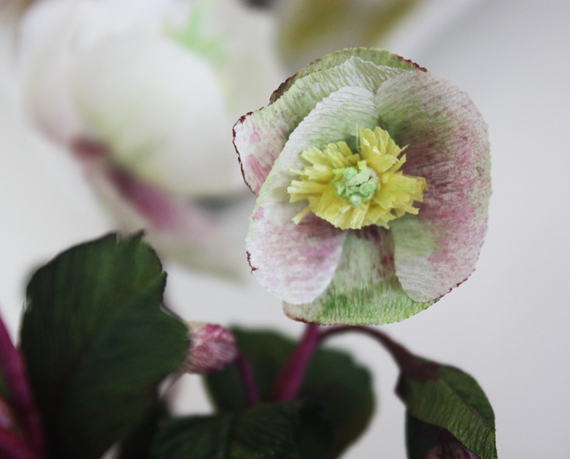
I knew I needed these hellebores the moment I saw them in her shop. It is one of my favourite flowers and the way Kathryn had situated them in that beautifully-tarnished cup with the moss was just too much to resist. It sits on my dining room hutch under a collection of wall-mounted plates and prints with similar botanical references. It looks perfect there!
The detail in Kathryn's work is utterly beautiful. Every surface is considered and done to perfection.
I loved the graphic nature of this mounted paper pear with blossoms. I had to have it. It's so striking and bold: very much like a Dutch painting. I have it hanging next to the wooden mirror over my dresser in my bedroom. Every time I wake up and get dressed I get to have a good look at it. It's become part of my daily routine!
Again, every single detail is considered.