Fun Fonts for May
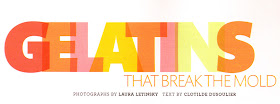
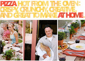
The May issue of Martha Stewart Living heralds the delightful introduction of a new, bold font in its well. I've posted examples below. To offset the boldness the art directors chose to make the letters transparent and to overlap them to create intimacy. They also chose to colour them in bright shades, playing up the theme of colour in this annual issue devoted to using colour in the garden, in cooking and in interior design. I have to say I quite like the effect: modern, impacting and fun.


Wanted to share a Martha moment. I met her at the NY Botanic Garden this weekend. She is lovely. I blogged about it here:
ReplyDeletehttp://momtrends.blogspot.com/2009/04/momtrends-and-marta-stewart.html
The new fonts look good - I will dream of seeing them in real life until the magazine comes out in the UK. I really enjoyed the April addition, after not being pleased with the poor content in the March edition. April had a youthful side to it and more interesting things. I personally loved the jackets, although missed 'From my home to yours' and wished that Martha had done a column as well as her trip to Prague, but I suppose I can't have everything!
ReplyDeleteHope the new job and apartment are going well and that you are settling in.
Pru
Yum.
ReplyDeleteand wonderful!
so fresh!!!